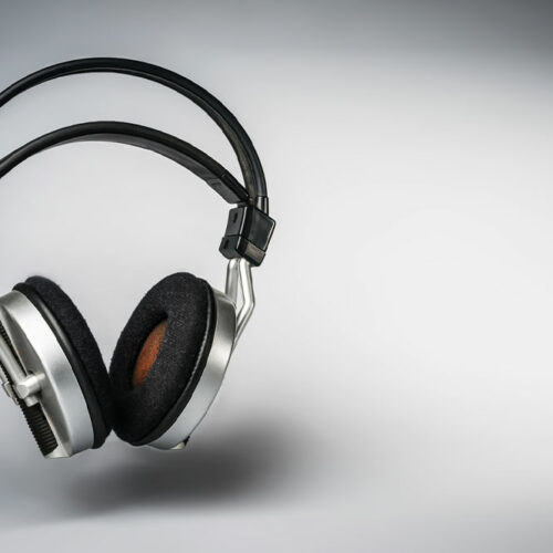
What to keep in mind before buying a pair of earphones

Whether you are looking for cheap earphones that you can replace every few months or investing in a good set of earphones, there are some things to keep in mind before buying a new pair. While most of us depend on advice from our peers or online portals before making a decision, there is something more important to consider: what we expect from them so that we can be clear about our purchase. Broadly, earphones can fall into three categories: In-Ear : In-ear headphones (also known as in-ear monitors) are great for people on the go as these are handy and offer excellent sound quality. Most models today feature a True Wireless System (TWS), which allows for a wire-free experience. Their size makes them convenient to carry around. On-Ear : On-ear headphones (or supra-aural headphones) are bigger but may not offer the best sound isolation due to their size. Over-Ear : Over-the-ear headphones (also called circum-aural headphones) are comfortable to wear for a long period and offer excellent sound quality. Their only drawback is that they are much larger than the other two varieties, making them heavier in weight. With in-ear headphones gaining immense popularity today, here are some things to consider before buying your next pair:


